
I have not much interest at this point in defending The Ninth Gate from its detractors; if you buy into the hokum and get on the movie's wavelength, its an enormously fun, sinister, well constructed thriller. But it's quite easy to see how it wouldn't be someones cup of tea, and the fact remains that in some notable respects it doesn't quite stand up to Polanski's more regarded work. What I do want to do here is point out and present (in an admittedly haphazard manner) the movie's most intriguing aspect: Polanski's persistent use of primary colors - those being red, blue, yellow and green - within the context of the rest of the film's dingy, earthy, dry color pallete. To what end are these colors used? Is it simply meaningless stylistic twaddle? Could be, but I doubt it. For a director as compositionally deliberate as Polanski, the colors feel important and thoughtfully placed, and so frequently pop out amongst the typically bland look of the film as to almost beg for further examination. Could the use of these colors be evidence of some deeply encoded aesthetic, a visual skeleton key to be used towards unlocking some of the narrative ambiguities? I would lean more in this direction then towards them being meaningless. Some of the colors are clearly more bound to specific characters/causes, but they also present themselves in entirely discordant manners at times. In short, I don't know what's going on here or what in the world Polanski is up to, but I find it all fascinating and feel compelled to lay it out, unformed thesis and all. So here it is, an index of primary colors used in Roman Polanski's The Ninth Gate (it should go without saying that major spoilers abound) :
Examples of the predominant, earthy color pallete of The Ninth Gate:


The primary colors Blue, Yellow and Red begin sneaking their way into the frames:


Product placement even gets in on the action:

Notice the sandwich of Yellow and Blue directories on the right of the window sill that sticks out like a sore thumb amidst the abundance of dingy, old-fashioned tomes that make up 'Bernie's Rare Books' :

A close-up a little later:

An echo of the above image, this with time Depp holding a copy of The Nine Gates wrapped in a Yellow cloth, positioned between two earth Blue airplane windows:

Our introduction to Boris Balkan - evil bibliophile and driving force behind Corso's quest to track down all copies of The Nine Gates - begins here in his Blue lecture room . Balkan will be closely linked to the color Blue throughout the movie. An agent of Blue, if you will:


Corso first catches sight of the mysterious character played by Emmanuelle Seigner in Balkan's room, and gets a glimpse of her appropriately Blue socks:

Corso later runs into the Seinger character on a train, and feeling like he's being followed, has a brief exchange with this mysterious, vaguely supernatural person (entity?) of ambiguous origin, who is credited in the movie only as The Girl. The Girl, while physically adorning each notable color at one point or another, is inexorably linked to Green throughout, both in her ever-present green jacket, and her piercing green eyes. "What's your name?" "Guess." "Green eyes?" "That'll do."

Fun with Blue, Red, Lucifer, Death, Fish, Pencils and Sleep:


Corso is trapped in Blue. The Girl's socks are now Red and Green:

Remember what Godard said about there being no blood in his movies, only red? One gets the sense while watching The Ninth Gate that a similar mentality is at work. Since colors exist as an elemental force as much as anything else in this movie, there is no smearing of blood, only the transference of Red:


Shortly after, Corso is nearly run over by a Blue car...

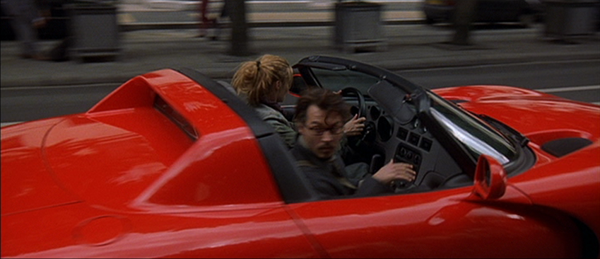
...before The Girl swings by in a bright Red Viper to escort Corso to his next destination...
...a mansion where Liana Telfer (Lena Olin) is heading a satanic ritual using one of the Nine Gate books. Corso observes the Red curtains from the outside before infiltrating the ceremony.


Corso snatches a glance at The Girl, who appropriately enough has located herself near what appears to be the only hint of non-Red decor in the whole joint. Of course it's Green:


Agent of Blue, Boris Balkan (note the dark blue tie, pale blue shirt), breaks up the proceedings, murders Liana, and retrieves his lost book...

...and exits back into the currently Blue-tinged world of the early morning:

Corso, chasing down Balkan, hops on board a livestock vehicle, and though there has been no trace of rain, is met with a perfectly axiomatic rainbow of vibrant primary colors hanging above. The image explains itself better than I ever could:

Corso tracks down Balkan in a secret keep where the Nine Gates must be assembled. The building tinted Blue to reflect its occupant:


That occupancy doesn't last particularly long:

Corso has sex with The Girl, or gives himself to Green:


No escaping now, a quick stop at a gas station proves...

...before walking into, well what exactly? His destiny? His doom? Who's to know. Corso is enveloped by the Golden-Green burst of light. Color as journey. Color as destination. The answer is in the colors:

8 comments:
What an excellent look at this very under-appreciated film! Count me as one of its most passionate admirers and I have fond memories of seeing this in theaters when it first came out. I've since watched it countless times on DVD and never tire of it.
I think the use of color had always impacted me on a subconscious level but it wasn't until your insightful post that really brought it into perspective. Awesome stuff.
J.D., thanks a lot for commenting! I share your admiration 100%. You're in good, albeit small, company.
It's really odd, I've read quite a bit about this movie online over time, and I've never seen anyone broach the issue of the movie's use of color (anyone feel free to point me in the direction of one if it exists - I've looked everywhere). It's the single aspect that has transfixed me most throughout the years, so I finally wanted to get it out there because there is clearly (as I think/hope I've shown) something going on with it.
Yeah, I don't think I've run across any review/article analyzing the color but it makes perfect sense when you consider what a masterful director Polanski is. It makes sense that he would add an extra layer to the film in the form color-coating it. Michael Mann does that with his films also and, David Lynch's film all have their own distinctive color scheme.
One of the things that I like about THE NINTH GATE is the cinematography of Darius Khondji who I think is one of the premiere DPs in the business. The work he did on David Fincher's SEVEN is incredible and he really did a fantastic job on Polanski's film. He creates this atmosphere that draws me in every time I watch this film.
The atmosphere is indeed perfectly evocative and intoxicating in its drabness, and I of course agree with your comments re: Khondji, his work is just consistently top shelf. We are definitely on the same page with this one, J.D.
I am a big fan of this sort of analysis, and I agree with J.D. that this is excellent Drew.
The fact you noticed the use of colour and can link it to the story makes it strong enough.
Anyway, what would it matter if it were a little spurious - it still makes you look at the film in a new light.
Thanks a lot Stephen!
This is an absolutely stunning post that examines an aspect of a film from a rarely disgnosed but fascinating perspective. I followed every new signal and every new screen cap and was enthralled by the incorporation of the primary colors. Like you I never found this to be one of Polanski's greatest films, but I did feel it was a film that rewarded with careful viewing and entertained. I love the initial look of those earthy tones, which segue into the spectrum of red, yello, and blue and the individual instances of there intrusion into the frames. At another thread recently, a discussion commenced on the use of red in Ozu's EQUINOX FLOWER, partcilarly the red tea kettle, which them became a continuing symbol.
Thanks a ton, Sam!
Post a Comment